We’ve all been there. You dive excitedly into a new piece of software only to bail a few minutes later, frustrated at being unable to understand it.
Frankly, a lot can go wrong when a new user tries out a new product for the first time. Bugs or errors cause accidental confusion. Or there's structural confusion, too, where a user struggles to understand the product. This could be due to the cognitive overhead required to grok the UI, or perhaps they’re thrown by the terminology being different from what they expected. Either way, the results are the same. Existing users may raise a support ticket or hit you up in chat. But if they’re a new user, they’ll likely just leave and maybe form a dim view of your product, preventing them from giving it another shot or recommending it to others.
To reduce support tickets and attrition, then, you’ve got to be proactive with user friction: find where it’s happening, dig into the causes, and come up with a solution. But that’s easier said than done. Isolating the cause can be tricky, and some products are inherently complicated. So what can you do?
Identify sources of confusion
First, you need to spot these sources of confusion. There are a few ways to do that, and the obvious starting point is to dig into the support tickets you get. These may come in via in-app engagement tools like Intercom or Drift or from a support platform like Zendesk.
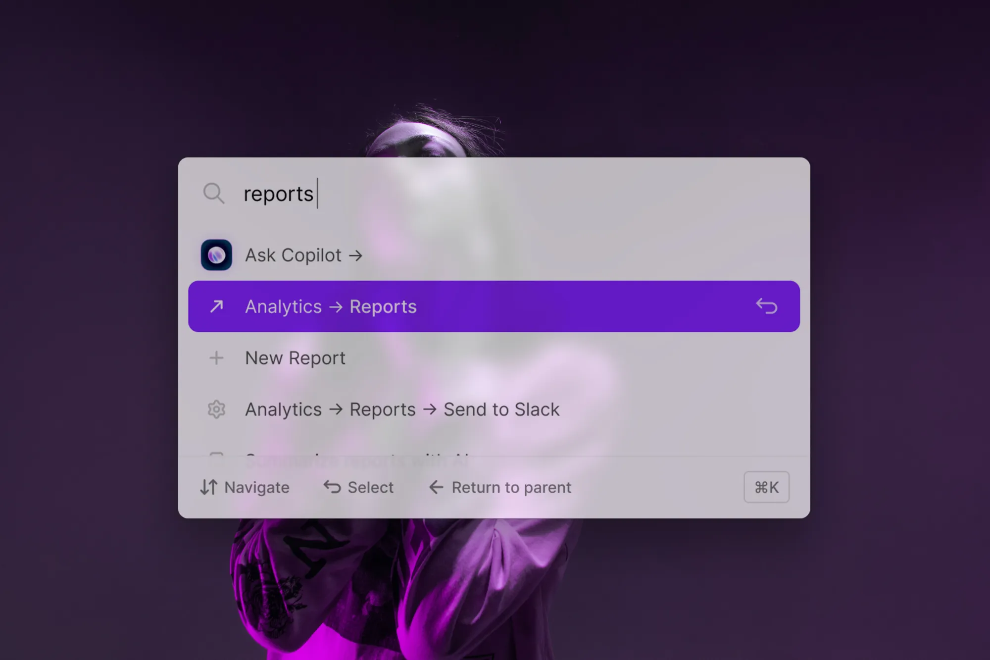
If you’ve built your product with a search bar, you can dive into the logs to discover search intent: what users are trying to do inside your product. Search intent gives you insight into sources of user confusion, like the terminology they’re using and deadends: things they searched for but didn’t find a solution for.
No search bar? No problem. There are a bunch of other onboarding tools that can help. A tracking tool like PostHog, Amplitude, or Heap is a good starting point. This will show you where users are getting stuck and dropping off in your user flows. And there’s user testing too, either in-person or via a session replay tool. Nothing is quite as humbling as watching a user fumble around what you thought was a frictionless flow 😅.
Take action
Whatever tools you use, they’ll give you an idea of where the problem spots in your product lie. Then you can better understand the cause and decide on a fix. It may just be a bug fix or refining some UI. Where there’s no obvious solution, a specially tuned nudge in Command AI can flag a help article to a user in your app, helping them to self-serve and solve their own problem. Let’s look at how you can set that up.
Nudge a help article on a confusing page
Step 1: Create the nudge
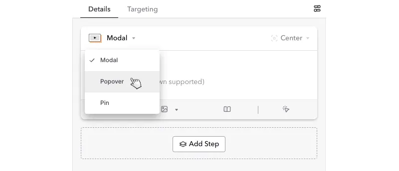
Use the editor in the Command AI app. Got Nudges, then select ‘Create Nudge’ and start from scratch rather than using a template. Then select the ‘Popover’ form factor, switching it from Modal.

Set the position to be the top-right, and then add the copy. To get the user’s attention, you’ll want to set a title that references what they’re trying to do.
Assuming you already have the help integration, you'll see your help docs listed. Select the appropriate one from the list.

Step 2: Set the targeting
Then we set the targeting: who will see it and when. For this one, we’ll want to show it to all users unless there’s a particular event or other trigger you want to use to show it.
But you want to make sure it only shows up on the right page in your app. For example. To show it only on the integrations page, select ‘If…’, and then for the current URL path, set the value of ‘/integrations.’
Save it, and now when we refresh our app, we suggest a relevant help doc to help users on that page to understand what to do next.
Fix things twice to reduce support tickets for good
Highlighting a helpful article can help to reduce the support load for a complicated or confusing feature. But, it's also important to follow through and fix it twice - that is, try and stop the underlying cause of that confusion from cropping up again. How will depend on the specific situation, but it's often things like:
- Investing in Quality Assurance. Catch bugs before they go live, minimizing unhappy users that hit snags. Hiring quality assurance testers or building out unit tests that must pass before a product is deployed. Or use a bug-focused session recordings tool like Sentry or LogRocket to alert you to new errors, hopefully before your users spot them.
- Condensing and Simplify UI Flows. Remove steps to decrease user fatigue to accomplish an action. Use familiar UI patterns and common modals (selectors, taggers, checkboxes, etc.) rather than innovate on something new.
- Informing the User More. Whether it's an animated spinner, a loading bar, or some form of in-app guidance. You can often get ahead of user frustration by clarifying when something is happening and what they need to do next.


